Let’s talk about elements, blocks,
and components. Structurally, these are interchangeable because
they all use tripartite units comprising a required type, and,
optionally attributes and content.
That said, in titling this doc Components, I’m referring specifically to Svelte components, i.e., XML tags with presentation & behavior dictated by the contents of <component-name>.svelte pages, for it’s these that make up notion2svelte’s final output.
In short:
The Web’s got elements: <hr />, <a href=…>🔗</a>, etc.
Notion’s got blocks(toggle for details)
Svelte’s got components: <Divider />, <Code language=…/>, and these are our current topic.
Capisce?
The 4 stages of component transformation
To orient you as you read the docs below, they are all organized using the same four headers, each
intended to give you a clear vision of the before-, during-, and after
1.As rendered in Notion
Individual components start their lives as blocks in Notion, completely independent, of course,
from notion2svelteYou’ll find a screenshot of each component at the top of each doc. Specifically, each “Step 1”
image is a screenshot of “Step 4,” as rendered on the source page on notion.so
2.Notion API
notion2svelte recursively fetches all the blocks on a page and stores the result
in a single notion-export.js file next to the final +page.svelte output
3.Svelte output
Here you can see the specific block-level transformation applied to get from Notion’s JSON
output to Svelte’s component syntax
{"type":"thingy"…} → <Thingy>…</Thingy>
4.Rendered content
By this step, notion2svelte is out of the picture but, just as it’s helpful
to see a screenshot of a block type in its original notion.so context, so
it’s helpful to see a version of the rendered Svelte component
Once you bring your own CSS and behaviors to the mix, the results will, of course, vary
Supported Components
“Regular” Blocks
notion2svelte is aimed primarily toward rendering “turn-intoable” Notion blocks
👇
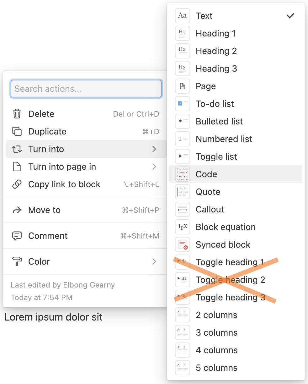
Notion’s interchangeable block types, as of 12/3/22notion2svelte does not yet support Notion’s newer Toggle headings**Pull requests welcome!
Specialized Blocks
Since the goal isn’t to replicate Notion entirely, but to rather to use it as a near-wysiwyg
editor, notion2svelte doesn’t support* most of the 3rd-party links and embeds that Notion provides
notion2svelte does, however, provide support for Dividers, Images (including
captions), and general-purpose Embeds
Inline Markup
When it comes to what Notion calls “annotations,” notion2svelte supports
them all.
Synced blocks
Synced blocks are effectively invisible to notion2svelte, but you can use them to create
reusable content across pages published via notion2svelteMost of these are supported, as documented Turn-intoable Block Components below, but I haven’t yet turned my attention to
The ToC ↓ demonstrates this synced-block technique