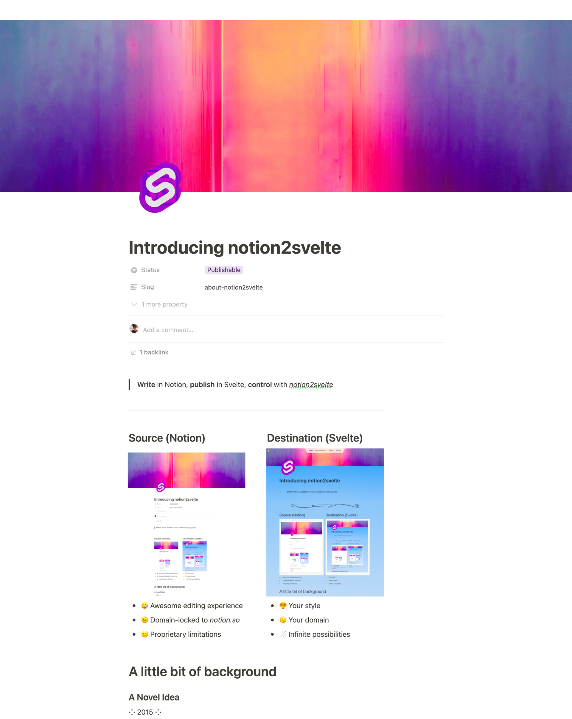
Introducing notion2svelte
Source (Notion)
😃 Awesome editing experience
🤨 Domain-locked to notion.so
😐 Proprietary limitations
Destination (Svelte)
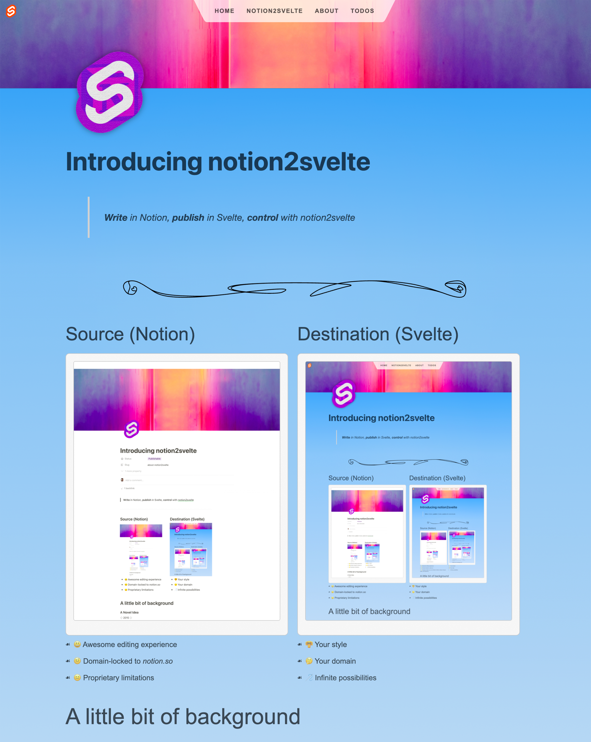
👘 Your styles
🤔 Your domain
🪡 Infinite possibilities

Why notion2svelte?
Store intermediary artifacts to-disk
My content is safely stored in git
I can access the full, raw JSON for every page from within my app, allowing me to add interactivity that Notion doesn’t allow
Command-line tool, rather than runtime npm package
100% decoupled tooling: want to “eject” from notion2svelte? No problem. Just stop using it. From the perspective of your Svelte app, the pages created by notion2svelte are no different than pages you code yourself
Write-your-own components
Provides wide creative freedom
Keeps notion2svelte simple
Why NOT notion2svelte?
What’s new in notion2svelte 0.2.0
Updated to work with SvelteKit’s newer routing system
<project>/src/routes/<slug>.json.js → <project>/src/routes/<slug>/notion-export.js
<project>/src/routes/<slug>.svelte → <project>/src/routes/<slug>/+page.svelte
Underline now gets its own component
You can now selectively expose props in a Notion database for use in your components. I haven’t
got this well-documented yet, but the TL;DR is: prepend props to be exposed with §. Any prop thus marked will be added (minus the §) to the pageStuff variable which you can reference from within your components.
How it works, grossly oversimplified
1.…written in Notion
2.…exported as a .svelte file by running notion2svelte
3.…published normally using Svelte Kit
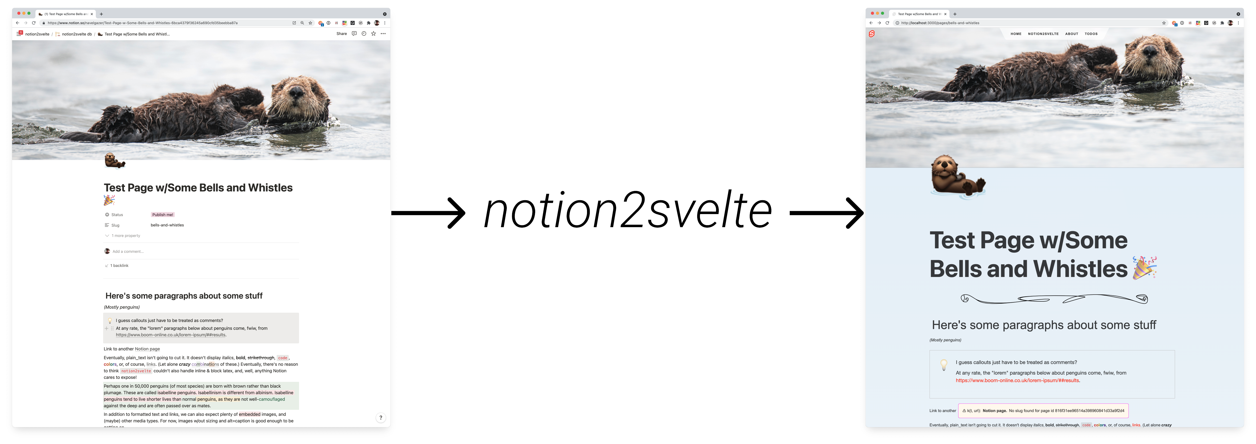
Example Time! 🧐

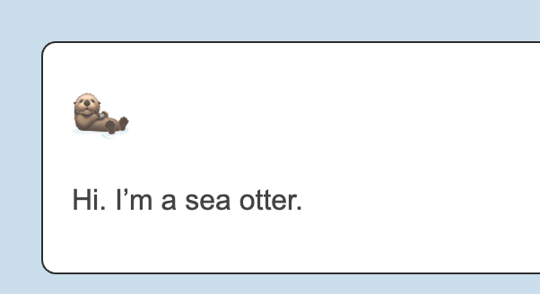
{
  "object": "block",
  "id": "011d46be-4bf6-4817-a0da-a849ec16f1aa",
  "created_time": "2021-12-20T10:00:00.000Z",
  "last_edited_time": "2021-12-20T10:04:00.000Z",
  "has_children": false,
  "archived": false,
  "type": "callout",
  "callout": {
    "text": [
      {
        "type": "text",
        "text": {
          "content": "Hi. I’m a sea otter.",
          "link": null
        },
        "annotations": {
          "bold": false,
          "italic": false,
          "strikethrough": false,
          "underline": false,
          "code": false,
          "color": "default"
        },
        "plain_text": "Hi. I’m a sea otter.",
        "href": null
      }
    ],
    "icon": {
      "type": "emoji",
      "emoji": "🦦"
    }
  }
}
  json
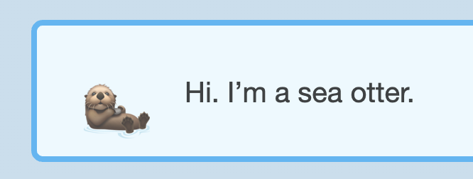
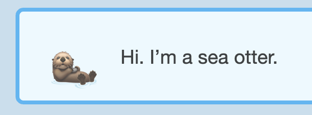
<Callout emoji="🦦"
  blockProps={{
	  pageId: 'fdc65179a8bd451caf67x9019204cfde',
		id: '011d46be-4bf6-4817-a0da-a849ec16f1aa',
		created_time: '2021-12-20T10:00:00.000Z',
		last_edited_time: '2021-12-20T10:04:00.000Z'
	}}>
  Hi. I’m a sea otter.
</Callout>
  html
callout.icon.emoji, callout.text[0].content, and, well, the blocks’ overall
type: "callout". The type tells notion2svelte which component to use, in this case, <Callout>.

A word about imports
import statements rendered by notion2svelte.
import Callout from '$lib/notion2svelte/Callout.svelte';
  html
How to use notion2svelte
Where to learn more
Find the code, start a discussion, or report an issue on GitHub
Ready to try it?
🏠 Browse the docs ⚘
High-level Discussion
Turn-intoable Block Components
Toggle Headings (not yet implemented)
Layout-only Components
Page-level Components
Annotation Components
bold → <strong>
italic → <em>
strikethrough → <s>